A call to action is a promise
A button should say exactly what happens when someone presses it.
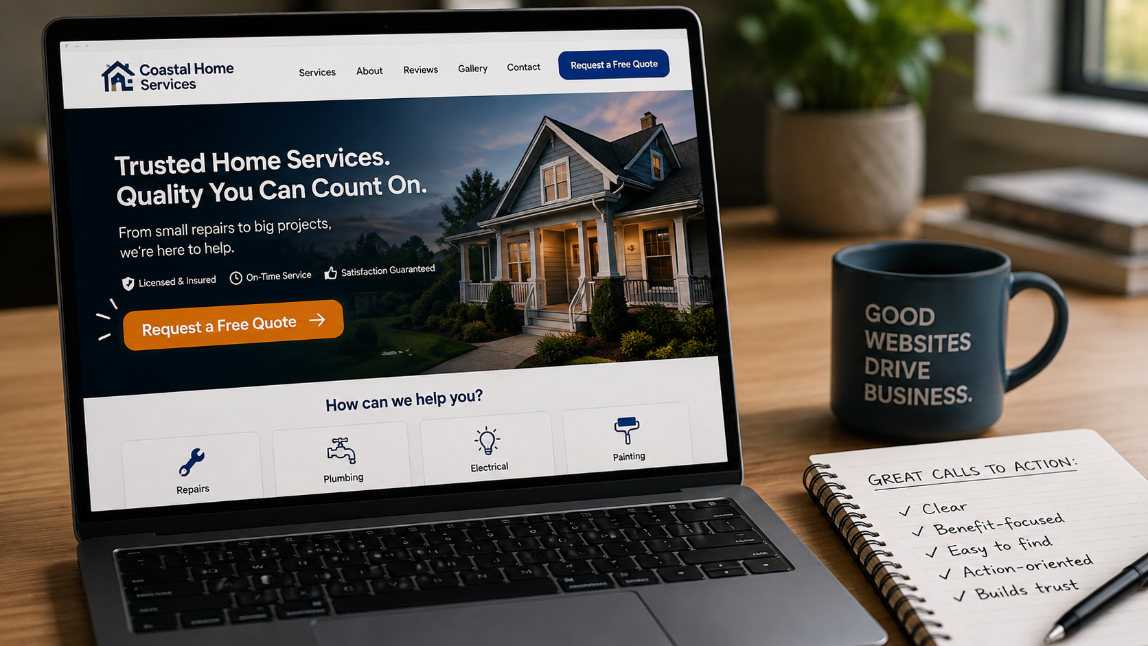
Request a quote
“Submit” describes what the browser does, not what the visitor gets. It is the default label on every form on the internet, which is exactly why it reassures nobody.
Naming the outcome also sets the terms. Someone who presses “Request a quote” knows a price is coming, not a newsletter. That single word change tends to raise both the number of submissions and their quality, because the people who press it want the thing you are offering.
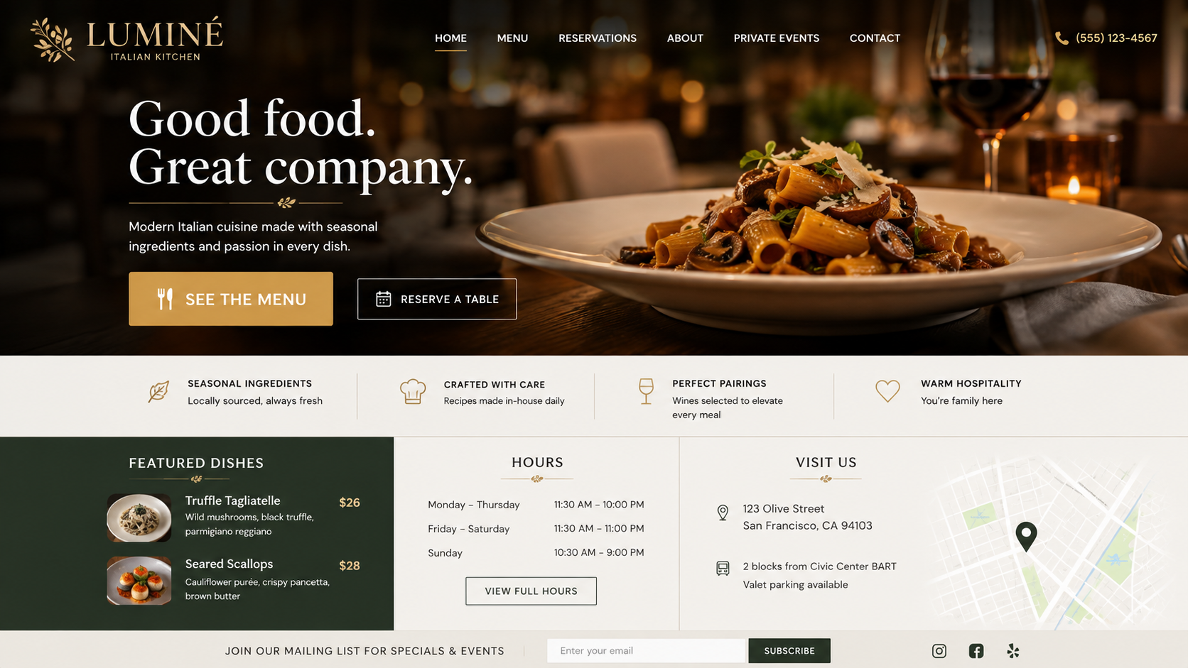
See the menu
“Learn more” asks the visitor to gamble. Learn more about what? The next page could be a menu, a story, a pricing table, or a form, and nobody wants to find out by clicking.
For a restaurant, the menu is the single most requested page on the site. Say so on the button. The same principle applies anywhere the visitor already knows what they came for: name the destination and let them go straight to it.
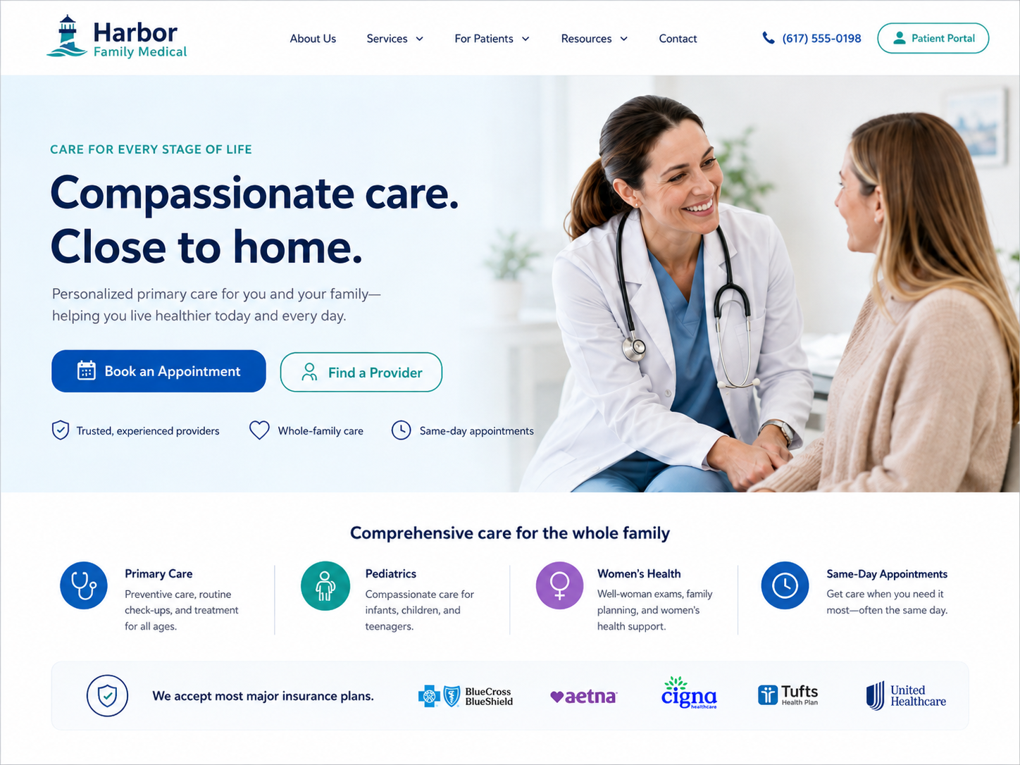
Book an appointment
“Click here” carries no information at all. It also reads poorly to screen readers, which often list a page’s links out of context, leaving a visitor with four identical entries and no way to tell them apart.
A booking button should say what it books. “Book an appointment” works for a salon, a clinic, or a consultation, and it tells the visitor a calendar is coming rather than a contact form.
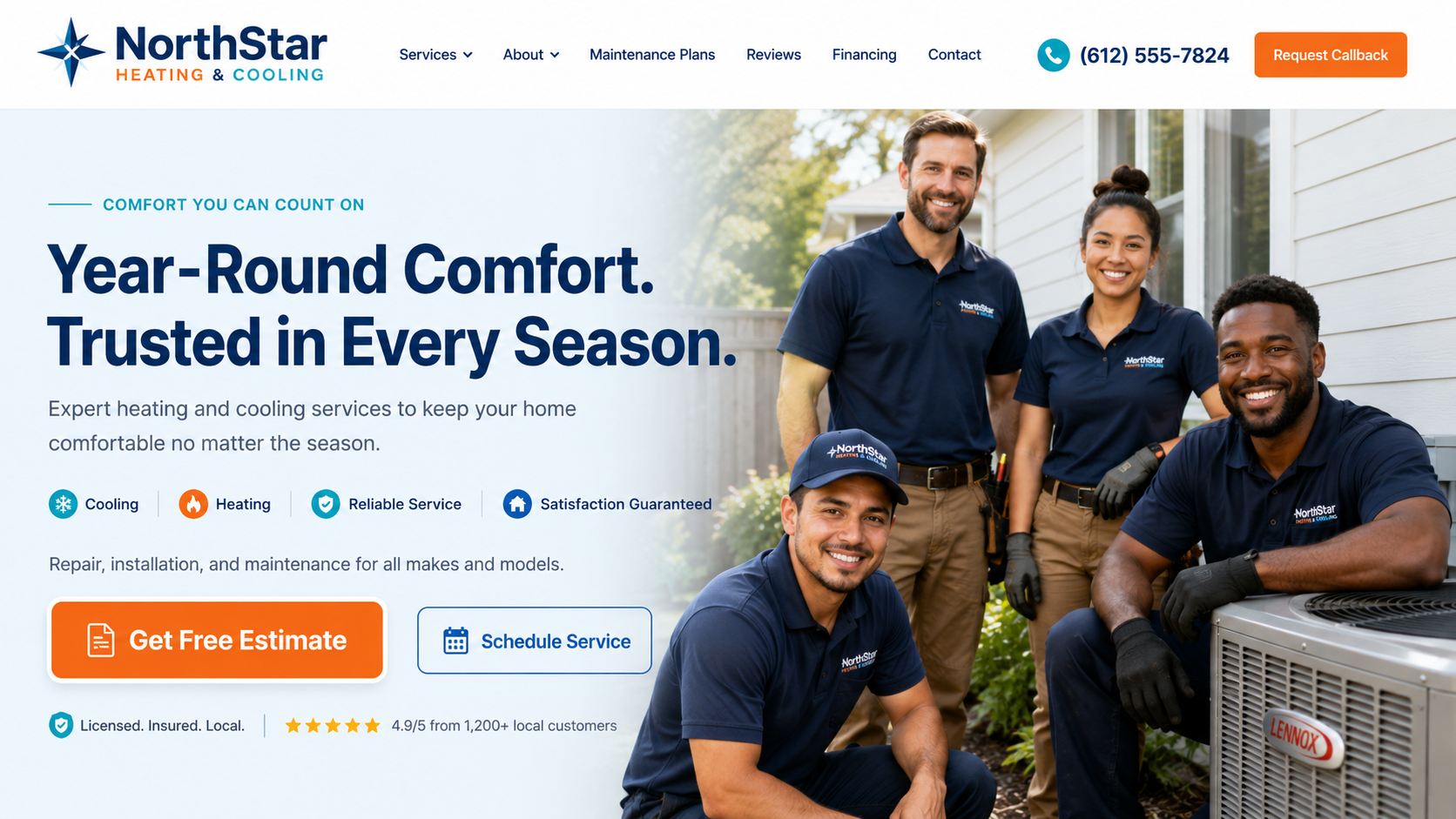
Get a free estimate
“Contact us” puts the effort on the visitor. It implies a blank message box and an unknown wait, which is a lot to ask from someone who only wanted to know what a job costs.
Leading with the value changes the calculation. “Get a free estimate” answers the cost question and removes the risk in four words. Keep “Contact us” for the navigation, where a general-purpose label belongs.
The label sets the expectation, and the next screen has to keep it.
Want this applied to your actual website?
The free audit walks through exactly these questions on your site, not a hypothetical one.
Get My Free AuditOne primary action per page
Pages with six equally weighted buttons ask the visitor to make a decision they are not equipped to make. Pick the one action that matters most for that page, give it visual priority, and let the others be quieter links.
Say it again where the decision happens
People rarely act at the top of a page. Repeat the primary action after the section that answers the objection: after the gallery, after the pricing explanation, after the reviews.
Have a question this did not cover? Ask us and we will answer it, whether or not you ever hire us.